|
Map Tutorial Step 2 - Mountains Odinist's map was the size of four standard 8.5x11 sheets, so in my imaging software I cut the image along its seams to make four separate pages of the map. I printed each of these pages the same way I printed the first (economy settings). This isn't actually necessary, but I wanted to blow up the size of the details before I started working on them, because it's much easier to draw something when you give yourself adequate room to draw it and just shrink it down later. I didn't want to be working in a confined little space where any little slip up is a big slip up. Mountains are easily my favourite part of any map. Graze your pencil along the general area you want your mountain rage to cover, taking into account the width of this range as well as the length. I say graze because we'll be erasing these lines later and want to make sure they come up easily and this first pass is just to sketch out where that top ridge of our mountains ought to run. If the line isn't flowing terribly naturally for you, you can break it up into a couple of mountain ranges butted together. 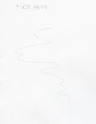 When you've got the lines laid where you like go over when with your pencil again, this time putting extra tension in your hand so the peaks and turns are kind of jarring, not unlike the way you'd move your hand to draw the edges of a continent. Keep it craggy! Tip: If you've broken a large map up into sections there are a couple of ways to keep these "seams" where we divided it from turning up in your final copy. One is to divide it according to the terrain. For example if you have a large mountain range in the northern half keep it together when you're tracing it so your mountain range doesn't end abruptly in the middle. Alternatively, you can just get a nice big piece of tracing paper and butt the two printed sections against one another under your tracing paper. 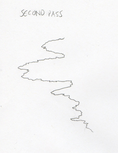 With that line in place we're going to pick a few of the most prominent peaks and use those as indicators of where our ascening-descending lines should go. Most of those are drawn the same way that first line of the mountain range was drawn, very uneven, very craggy, but this time let it kind of fade out towards the bottom where the mountain levels off into the rest of the ground. These really prominent peaks don't occur that often, but we can fill the space between them with some shorter steeper cliff lines. These are all just short swift down strokes. Sometimes I make them a little less even for effect. 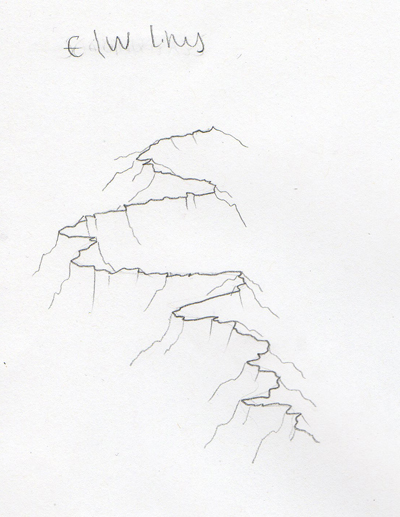 Because we're working in pencil and we've kept a fairly light pressure we can add and remove what we want and when we're satisfied with our mountain range, then we'll go over it with our fineliner. This is where we start to need a couple different pen sizes. I trace the top ridge (the first line we drew) with a 03, and try not to smooth it out as you go, we want these lines to stay rough. Then I go over the lines that run down from this ridge to the left and the right with the 01. Once we've traced all our pencil marks we can erase them. 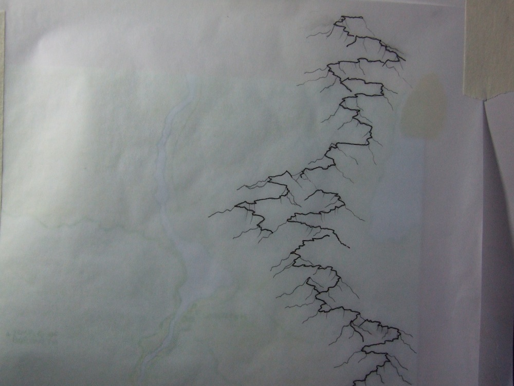 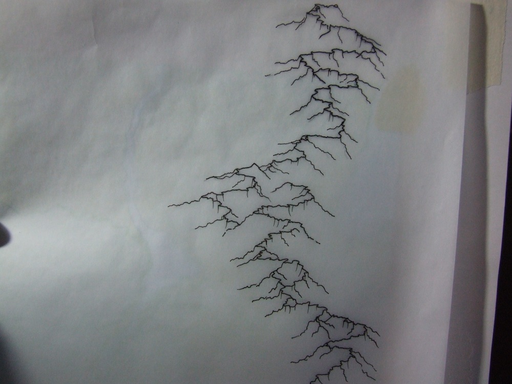 click images to enlarge Lastly, and this takes a little judgement on your part about how dark you want the shadows to appear and on which side, we're going to shade these hills a bit. I picked the north west side for shadows. Now with my pencil I'm going to pick a few places for some tight hatching.  Then I pick a few more places for looser hatching 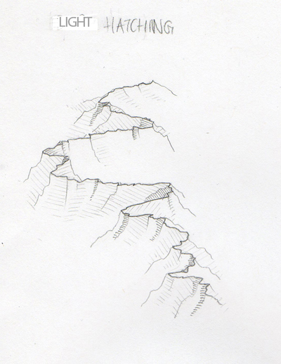 When I like all the areas I've shaded I'm going to finalize that hatching with my 005, that ridiculously thin pen. It's not bad to treat this little pen like a pencil. If it doesn't block in the WHOLE line because you're going too fast, that's all right. Little defects like that give a handdrawn map extra character. With my whole mountain range inked it should look something like this.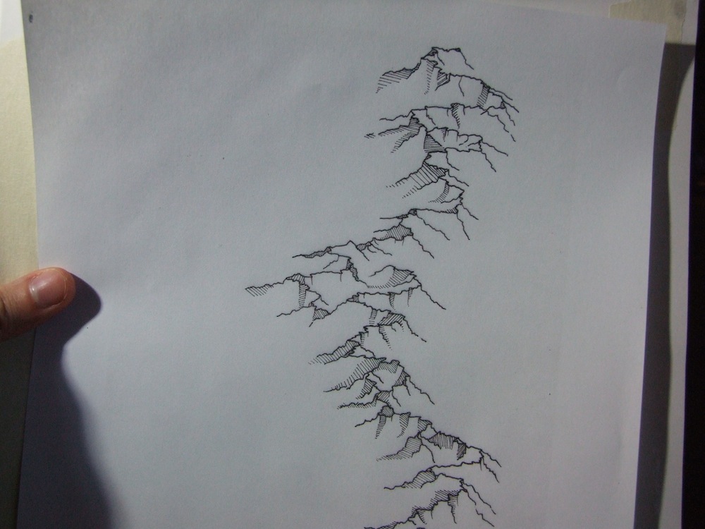 click image to enlarge When you've done all your mountains to satisfaction you can scan them and add them to your .ai file just like we did with the basic shapes of the map. Click here to read about that if you skipped it the first time. Remember to put each additional piece you scan on it's own layer or at least it's own object group in illustrator. It's just easier to select one thing at a time that way. When I live traced my mountains they came out looking like this:  If you want further explanation about drawing mountain ranges like this CLICK HERE. To hear a bit about the forests in this style let's KEEP GOING this way. |